So first I went to FontBundles and found this font

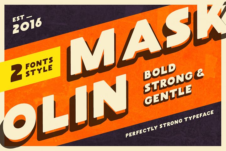
Maskoolin
I really like the 90s feel of the font. Its playful and I feel like it compliments the comedic value we plan on incorporating in our opening.

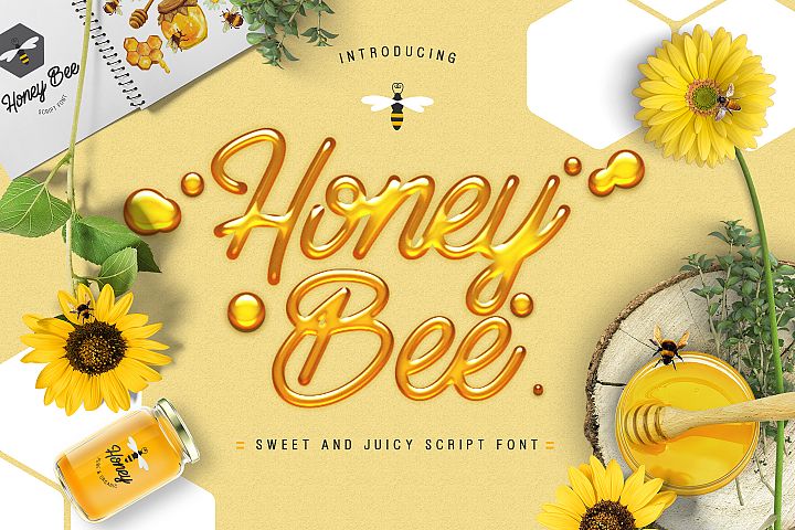
Honey Bee
This font is definitely something different. For some reason I feel like it does a good job describing the feel of the movie. The contrast of the smooth and flowing font and the dark opening will be incredibly interesting.

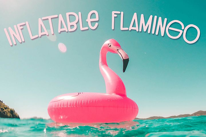
Inflatable Flamingo
Ok I really like this font. It gives of that 90s feel and definitely follow teen movie conventions. It also adds a refreshing change to what normal credit fonts are. I really want our finished product to be something out of the ordinary.
So for right now, I'm pretty sure one of these three fonts is gonna appear in our opening. Of course, stay tuned for more updates.
No comments:
Post a Comment